Category Archives: Component

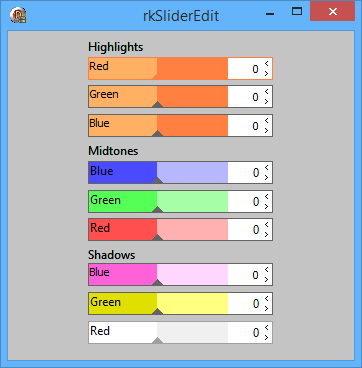
New component TrkSliderEdit

Showing rkSliderEdits with different colors

Some color alternatives

TrkSliderEdit in all its glory.

This component will make it a lot easier to handle input values. A slider, an edit and a label, all, in one component. It could not be any easier that this. Well that’s my opinion. I use this component in my photo edit program a lot and it saved me a lot of time. Maybe it can help you to.

Use arrow keys to step value up or down by one or page up/down to step value in steps of ten. Press space key to enter value or press mouse button in edit area. Mouse click in the slider area will move the slider to the new position.

I hope you find this component interesting and useful.

If you have any comments or suggestions give me a word.

Download source code and demo

Glassbutton updated to v2.4

This is a long forgotten update to my rkGlassButton component. Some bugs have been corrected and it now work more as expected.

The first ting first. The autosize property is working like it should.
Secondly the down property also work when duostyle is active.
Last but not forgotten OnClick now work as expected.

Please report any bugs you find to me.

Hope this helps a little

Download rkGlassButton v2.4

rkSmartTabs updated to 2.1

This is just a post to inform you about the availability of the latest rkSmartTabs.

Now dragging of tabs works correctly and hints are working properly.

Making this work was a lot more difficult than expected but the hardest part was to make all the transparency work correctly.

I hope you find this update useful, now you should download it and have some fun.

Download it at the download page as single component since collection has not been updated yet.

Some small updates for November

The updated SmartPath and SmartTabs

Updated components

This is just a small update for rkSmartPath and a beta release of the updated rkSmartTabs.

Not very much new stuff but I have added a feature to the rkSmartPath so it will always show at least one item in view. Meaning that the folder name will be truncated to fit in view, similar to how it is done in Vistas path bar.

The rkSmartTabs uploaded is the newest version and is in beta stage. Do not use it for real applications yet. I only uploaded it for people that want to test and get a feel of how it works. I am always curries myself so I thought maybe someone was interested. There are some limitations in this version as I know about fx hints are not working and tabs can not be dragged. So set ShowHint to false and AllowTabDrag to false when testing. If you find other strange stuff happening I would like to hear about it so I can do something about it. Thanks!

I hope you find it useful so far.

Please download these components as single components in the download page. They have not been included in the collection yet.

The collection will soon be updated.

Regards
Roy M Klever

VistaProBar updated to version 1.7

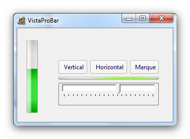
VistaProBar in use

New VistaProBar "style"

This is a small update were I only have added three properties: BackColor, BorderColor, CornerColor.

I think this makes it a little more useful. I needed the properties to get my music progress bar.I think it looks good.

Have fun.

Download rkVistaProBar from download page. Collection not updated yet.

rkSmartPath updated to version 2.5

SmartPath in use

SmartPath in use

Finally I got some time to post an updated rkSmartPath.

Whats new:

* New color properties: – ColorEdit, ColorEnter and ColorExit
* Possible to hide first level: – HideFirstLevel
* Added an optional button: – ImagesBtn, ImageIdxBtn
* I also added new arrow style for first item
* Some code update

Download from download page. Collection has not been updated yet so download component itself.

A smart dialog solution

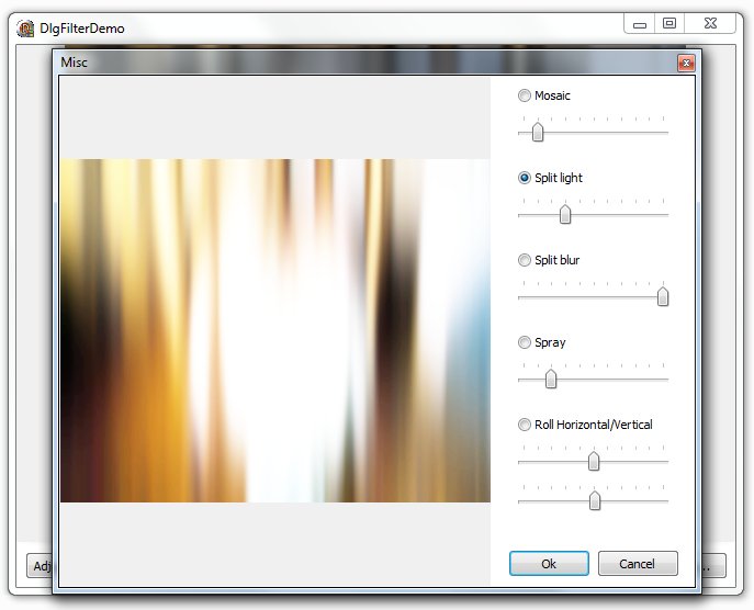
An image of a filter dialog

Sample filter dialog

When doing graphics filters I am often annoyed by the fixed dialog most people use, so I decided to try to come up with an alternative solution and this is what I did.

To compile the demo you need to install the included component, rkFilterPreviewDialog.

This component will display a dialog according to the instructions in the controls property. You can add a label, trackbar, radiobutton or a space command.
Commands you can use are:
L:Just a label
R:Radio button:0 // change zero to one to select it
S:16 // a 16 pixels space is added before next component is added
T:0:100:10:10 // Trackbar:Min:Max:Value:Frequency

You can use the properties CtrlBegin and CtrlEnd to say where the dialog starts and end. From line to line. See demo to get a better view.
Remember to set UseBeginEnd when using these properties.

Here is the setup for the dialog in the picture above.
— Misc
R:Mosaic:1
T:0:100:10:10
S:16
R:Split light:0
T:0:10:1:1
S:16
R:Split blur:0
T:0:100:10:10
S:16
R:Spray:0
T:0:50:10:5
S:16
R:Roll Horizontal/Vertical:0
T:0:100:10:10
T:0:100:10:10

The demo shows how everything works a lot better than I can explain.

Download Component, demo and exe (505kB)

rkSmartTabs now smarter

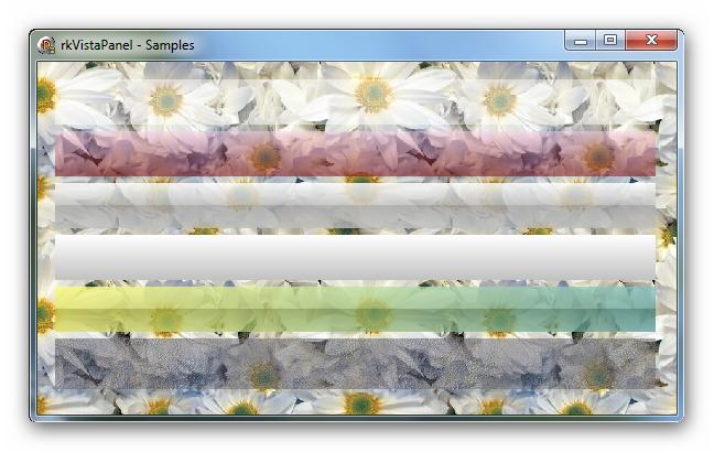
The new SmartTabs component

rkSmartTabs in use

Version 1.8 of rkSmartTabs is up. A lot of new stuff in here.

A few things that are new.

Tab captions are now rendered a little different and close button are adjusted down a little.

You can now pin a tab to the left side. See image above, three pinned tabs to the left.

Use UnpinTab(ATab) to unpin a tab and PinTab(ATab) to pin a tab. A pinned tab can only show a glyph. You can use TabPinned(ATab) to check if a tab is pinned. Because of the way pinned tabs are handled you should use SetTabName and GetTabName to set and get the caption of a tab. To get which tab is under the cursor you can use the GetTabAtXY function.

There is a new property, OnCustomDraw, that will lett you draw onto a tab. This can be used to paint a progress indicator or other thing you would like to put on a tab.

Some new properties
Now you can control the colors of your tabs
The border colors
ColorBrdActive
ColorBrdHot
ColorBrdInActive

Text outline colors
ColorOutActive
ColorOutHot
ColorOutInActive

Color of the tabs
ColorTabActive
ColorTabHot
ColorTabInActive

Tabs caption text
ColorTxtActive
ColorTxtHot
ColorTxtInActive

GdiPlusText, this property is used when painting tabs in aero glass. I could not make gdi text work properly with aero so you need to enable gdi+ text rendering when using aero. If not using too transparent tabs aero works ok.

You can set the opacity of a tab state using the following properties
LevelTabActive
LevelTabHot
LevelTabInActive

Outline Text can be outlined by setting this property to true. This is not operativ when using gdi+ text

PinnedStr New in this version is pinned tabs set the symbol string you want to use for marking a pinned tab here

SeeThruTabs This property will let the other tabs shine thru, see what it looks like in picture above

Download at downloads page

This component uses the GDI + headers found at progdigy.com
In Delphi XE this is not working very well… one solution might be to rename the gdi+ units. I am trying to resolve this issue but as long I can not test, it is a little difficult. Maybe use graphics32 as the base is better?

Regards
Roy M Klever